New Kia Logo
The Story Behind The New Kia Logo
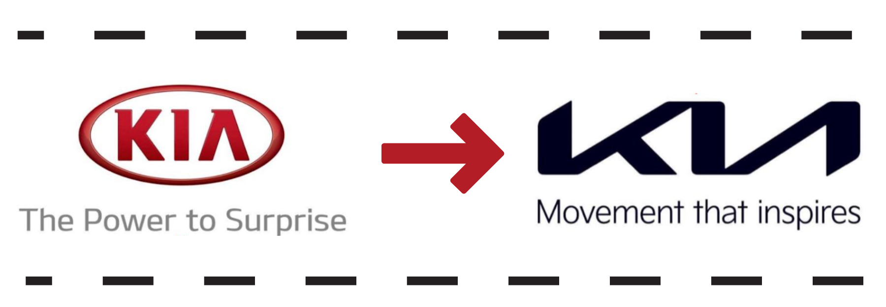
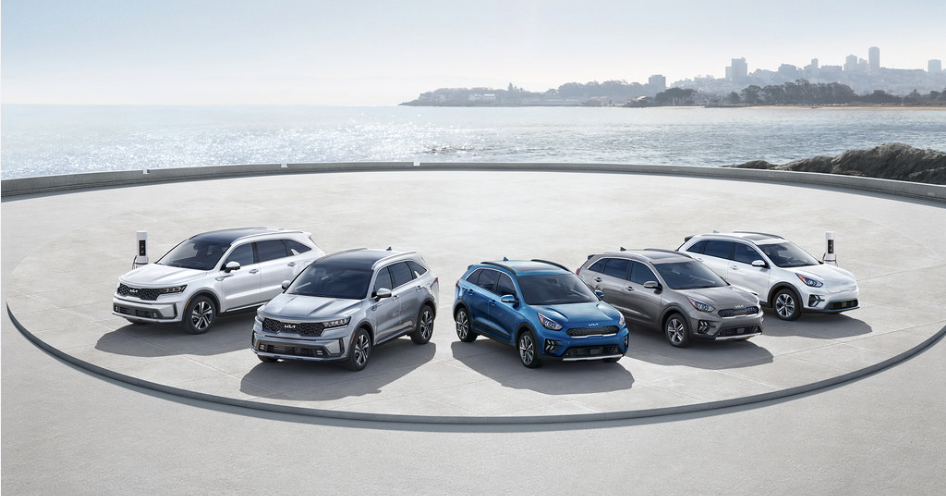
The logo of a business is one of the most essential and fundamental elements of any brand, whether you are running a local shop or an international foundation. When it comes to the car manufacturer, Kia, the brand is familiar with change, as it was originally launched and founded in 1944. Since then, Kia has gone through numerous branding changes and transformations. As of 2021 and 2022, Kia began unveiling an entirely new logo that can now be found on newer models of the EV6, Telluride, and many more.
Why Did Kia Change It’s Logo?
Originally, Kia first announced plans to develop a brand new logo in 2021. The goal of an entirely new logo was essential to spread the word about “Movement that inspires”, a phrase coined by Kia while unveiling project plans. When the announcement was first made, Kia celebrated with a unique ceremony of specially designed fireworks to show off the unique Kia logo design in the sky. This also landed Kia a special spot in the Guinness Book of World Records in 2021.
According to Kia’s President and CEO, Ho Sung Song, the idea behind the drastic transformation of the Kia logo was to inspire movement and progress forward toward futuristic technologies, safety features, and hybrid automotive solutions.
Does ‘KN’ Have a New Meaning for Kia?
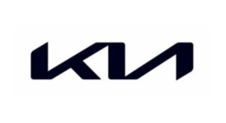
At first glance, the new Kia logo may appear as the letter ‘K’ alongside the letter ‘N’, but backward. However, the ‘KN’ appearance is an attempt to symbolize the synergistic nature of working together and streamlining operations in terms of movement, development, and technological advances. So, while the logo may appear as ‘KN’ at first glance, it is actually an artistic design that is still meant to be read as ‘KIA’.
What Does the New Kia Logo Mean?
Because Kia intends to remain at the forefront of hybrid EVs, or electric vehicles, as well as sustainability and forward-thinking safety technologies, its logo is meant to demonstrate just that. Rather than using a basic traditional Serif or Sans Serif font, the new Kia logo has been drafted using symmetrical straight lines that connect without disruption from one end to the other.
The current design of the new Kia logo is meant to draw the eyes upward, with swift vertical symmetrical lines bringing the entire logo together. Drawing the eyes upward and allowing the viewer to seamlessly view the logo at one quick glance also highlights Kia’s bold moves towards the future advancements in technology, safety features, and sustainability the company is making. With Kia unveiling its new logo in 2021 and 2022, it’s not uncommon to find the latest Kia models with the new logo imprinted on the vehicles themselves. Whether you’re in the market for a new Telluride or EV6, the chances are good that you will likely run into a Kia with its new logo in place.
 Warranties include 10-year/100,000-mile powertrain and 5-year/60,000-mile basic. All warranties and roadside assistance are limited. See retailer for warranty details.